SIMA:
Sustainable Information Made Available
Disclaimer: This brief was assigned to us as a Group project between 4 classmates including myself.
Time Frame:
2 weeks of Conducting Research
2 weeks of ideating and prototyping
2 weeks of Usability testing
2 weeks of High fidelity Design
Role:
User Researcher
Information Architecture
Wireframing
UX/UI Design
Tools:
Miro
Figma
Mentors:
Kira Street
Kane Ford
Project Overview
We were tasked to create a product to help raise environmental awareness and after multiple discussions with my team, we planned the following steps accordingly to maximize our design decisions to produce a human-centered product. The power of this movement leaves us with the task of answering one question:
“How might we help companies raise awareness about their current and future environmental initiatives to their consumers”?
We believe this question will open lots of avenues of information giving us key insights and takeaways that will lead to a greater relationship between consumer and brand.
Challenges
The challenges we faced were how to display these environmental efforts effectively. Understanding that most companies will have a section dedicated to this information, we wanted to explore multiple ways in order to execute this properly. Making these facts more accessible, would eliminate any forthcoming confusion about where the company stands. In conclusion, handing them credibility.
Why?
In the current state of our environment, we feel it is necessary to preserve it. Not only should we be conscientious, but hope to persuade the public to assume our duty to be a part of something bigger than us. We believe by creating this product and providing accessible knowledge to the public, will give peace of mind of purchase from the right company and confidently do so.

Defining the process
Before we dove straight in, we had an initial meeting to discuss and plan our method of approach. This approach helped us set the roadmap to keep us on schedule and determine key milestones with deliverables.
Research Phase
In order to better understand how users could be aware of the current and future environmental initiatives from different companies, we interviewed users using sustainable, environmentally friendly, and recyclable products. We hope to learn what other brands are doing to show their environmental initiatives & how those methods have worked or not. The overall objective is to use that information to enhance current or create new strategies that will help businesses display their initiatives in a way that is noticeable & amplified to their current & potential customers.
Next Steps
Research other companies that display environmental impacts
How can we display environmental initiatives efficiently
Look at other B2B2C websites
Conduct Interviews to understand our users
Discover the goals, needs, motivations & frustrations of potential users
Target Demographic
Gen ZMillennialEco-ConsciousUser Interviews
In total, 4 people were interviewed. There were 3 males and 1 female. All of the participants fell in the millennials category. They all had similar outlooks on how they viewed brands that displayed their environmental efforts and were willing to spend more money on products if the brand they were supporting helped the environment.
Surveys
For our surveys, we got a total of 48 participants. The ages ranged from 18 to 65 with a majority of the participants being between the ages of 18-34. As expected, the Gen Z & Millennials in the group all had similar answers in terms of how they shopped & researched for products that had a positive impact on the environment.
Secondary Research
We looked at a multitude of other independent brands, companies that only sell environmentally conscious products, and third-party companies. Through our research, we were able to come up with many key insights that would ultimately help us move forward with our design. We’ve noticed that when other brands display the badge of 1% of the planet they don’t have a description of the logo itself i.e. (sunskis) compared to Patagonia they have a separate page that explains in detail what 1% of the planet is. This gives more credibility and effectiveness.
Major Findings
Transparency
Companies that are transparent with their initiatives and have reports on their efforts are more likely to garner customers
Customers feel like they can trust the brand which will continue to build on customer loyalty
Accessibility
Not many viewers know about a brand’s initiatives nor do the research
Some feel as if the information about the brand’s efforts is not easily accessible
Credibility
Some feedback we received was that some brands aren’t as credible as they say they were
This builds distrust towards the brand and customers are unwilling to support the brand overall
Summary
While there are great examples of companies such as Patagonia, Chipotle & Athleta who market their efforts effectively in many ways. It is the way of full transparency, constant reminders & brand identity that creates their loyal consumer fan bases. As ethical businesses start to transparently display their environmental efforts, it is important that they properly gain the trust of their consumers by providing all the information about their product(s) and how they help the environment. All information should be accessible and included in the packaging when possible.
Discovery and Analysis
After compiling our data and research we began to synthesize our research. I created a hypothetical persona to keep in mind the user that we were designing for. I wanted to humanize our design in order to produce a human-centered product. I focused on asking open-ended questions to gather as much information.
UX Persona
Card Sorting
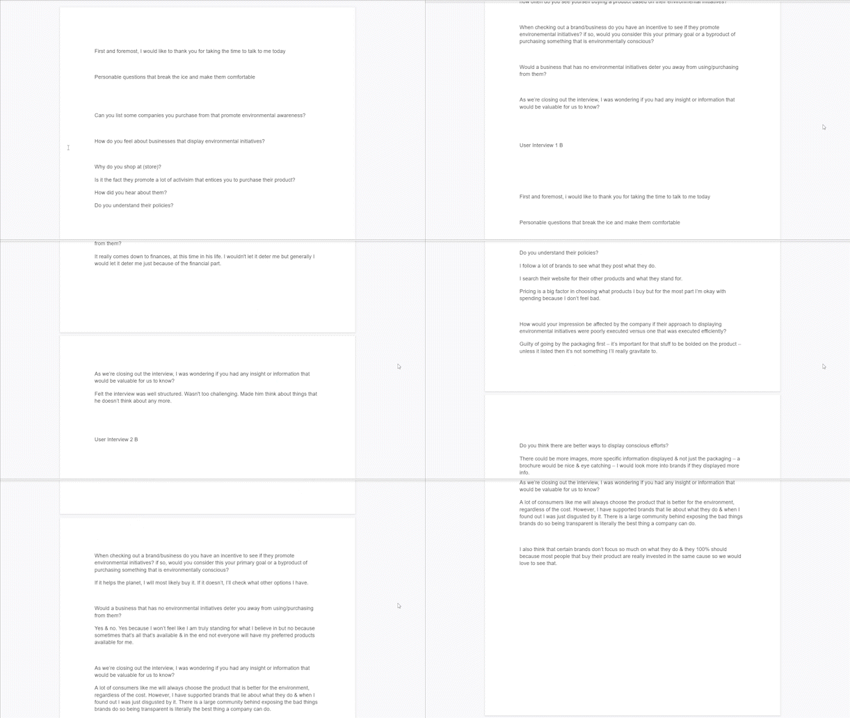
User Interview Transcripts
Research Summary

-User Interviewee 1
“I have a hard time trusting brands unless I see actual evidence.”
These wireframes and final prototypes were done with the team
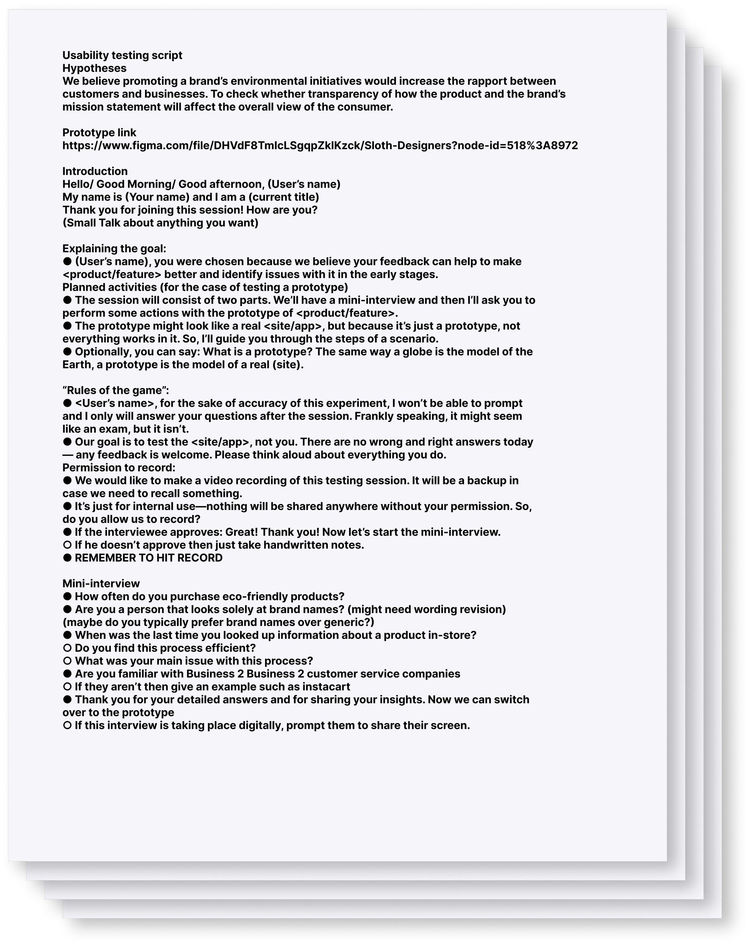
Our research synthesis cemented a strong foundation to launch into sculpting wireframes to optimize the layout's flow. After we finished our ideation and prototyping phase, we had a series of tasks we wanted our users to complete to help us determine the current state of the product subsequently involving myself to create a script for us to follow. Following usability testing, we began to compile our results and found an array of issues that we could remedy which then lead us into creating our High-Fidelity mockups.
Concepting:
Wireframes
Usability Testing
Testing Report
Testing Script
Issue 1
Some of our users felt like the rating system came out of nowhere and had no explanation for it. There had been some feedback that when analyzing the graph participants had a difficult time discerning if they meant negative or positive.
Solution 1
I added a description of our rating system and included it on our home page to eliminate confusion. Furthermore, I changed it from a numerical-based value to symbols for easier digestion.
Issue 2
Users had a sub-optimal time locating some of our features on the page, for example, the in-depth article on a brand’s environmental initiative. Another problem was our use of typography throughout the product.
Solution 2
Calling back to proper UI patterns and graphic design, we deliberately changed the elements to optimize quicker communication so our users wouldn’t have a laborious effort navigating our design.
Hi Fidelity Mockups
Final Iteration
After usability testing, we were able to apply feedback in order to remedy pain points. We found great insight from our testing which lent it’s hand in our transition to High Fidelity designs.

Enhancement
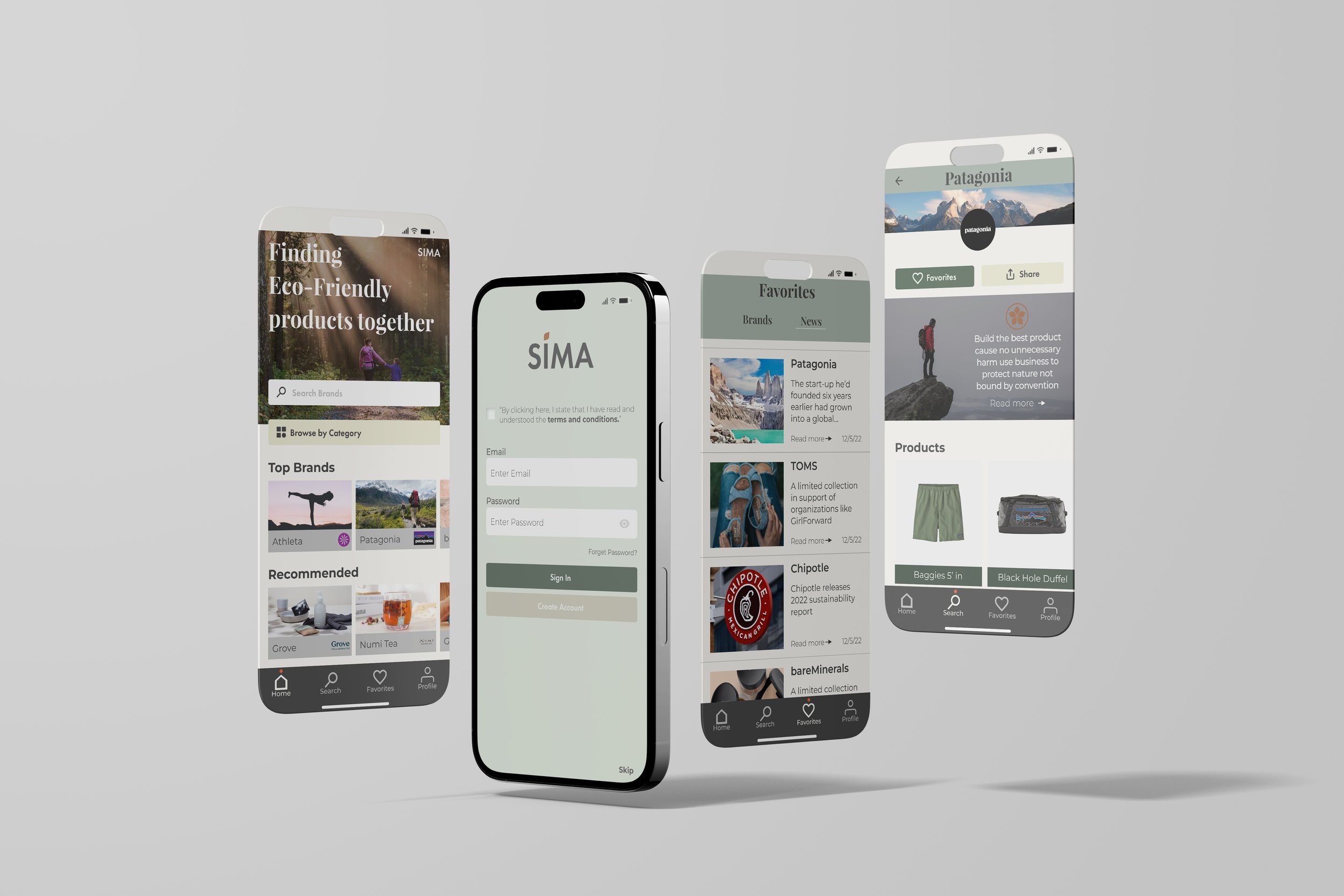
Solo project transitioning mobile to Native Application
Working with a team was extremely satisfying. This allowed us to bounce back ideas back and forth with group members allowing us to hatch some ingenious concepts. The design journey was everchanging with a bunch of moving parts that coalesced into something we deemed could make an impact on environmental change. As design is, I knew there were many ways we could improve this product in multiple avenues. So upon careful consideration, I deliberately used the previous information gathered, along with my own research to produce a native application. I saw this transition fit for our cause and had this belief this product with fit rightfully so.
Iterative Ideations
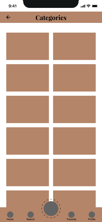
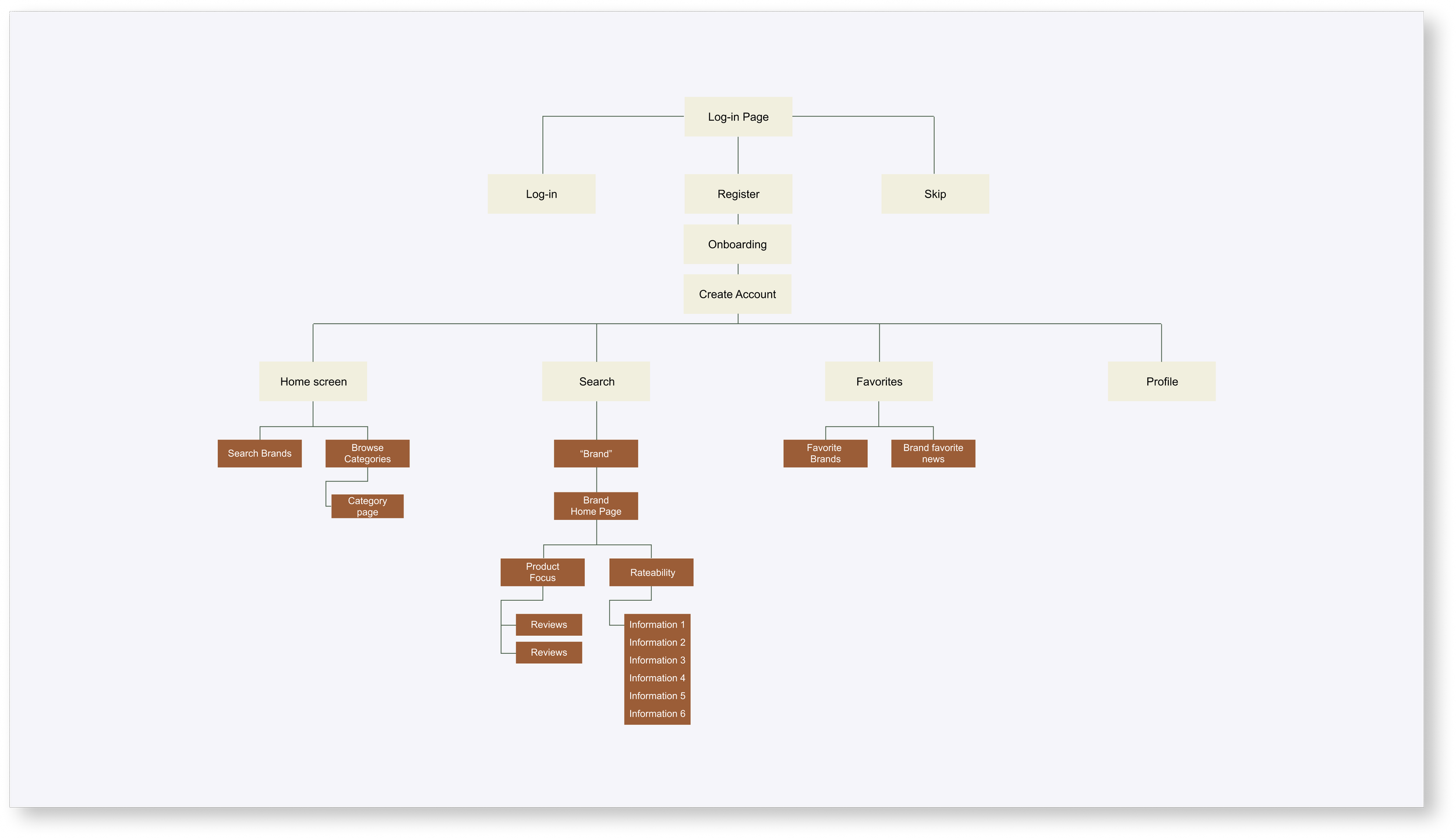
I conceived multiple wireframes starting off with a quick information architecture to reach the most desired user experience. Using the information and feedback from Version 1, I decided that the best approach to this product would transform its previous iteration a mobile web app., into a native application for a more personalized experience. Furthermore, it would give users effortless accessibility.
Task flows
Information Architecture
Design System
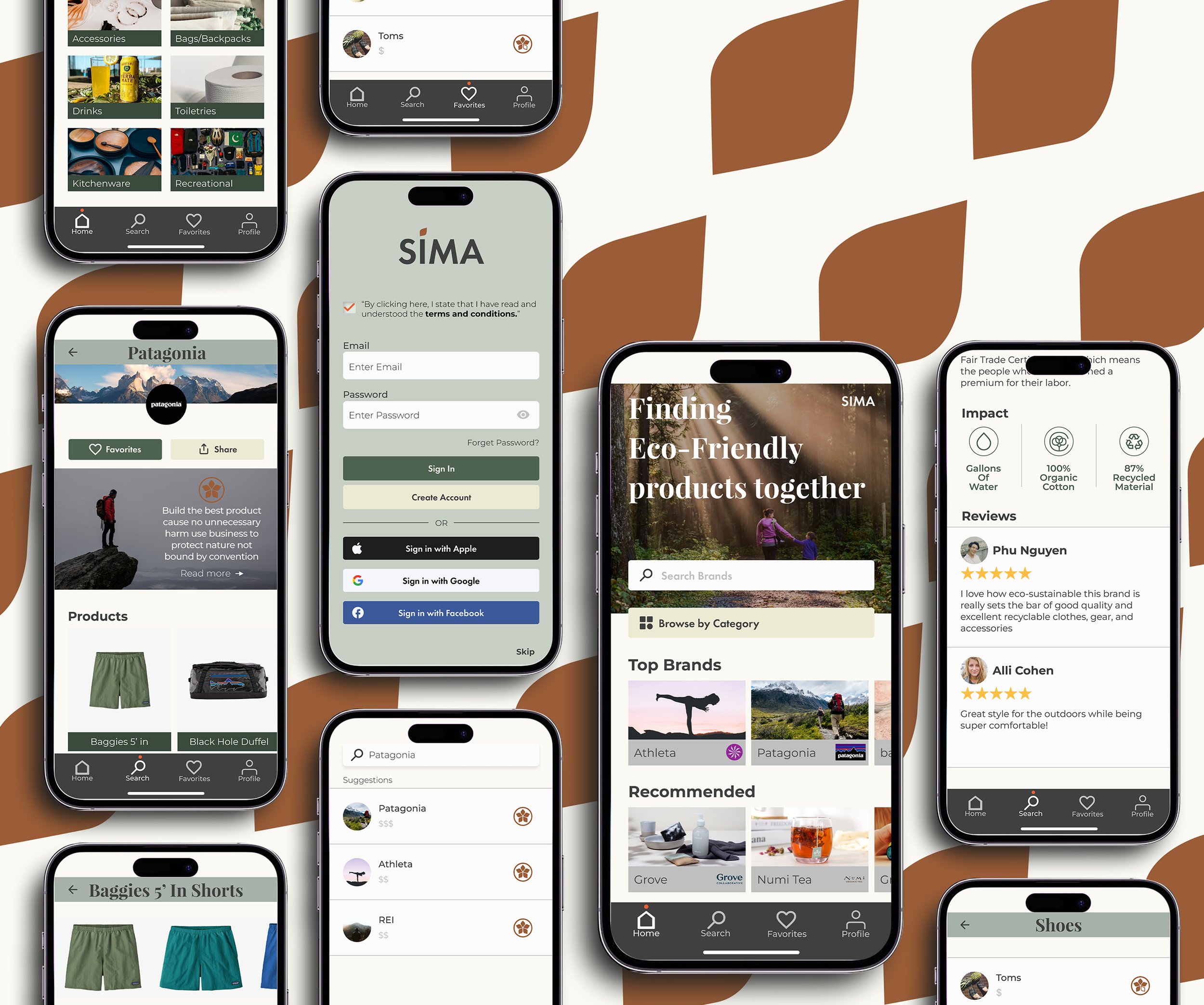
I created a style guide before moving on to Hi-fidelity design to ensure consistency throughout the whole product. We chose an earthy color palette to match the tone and the mood of the brand wanting to create something that was friendly, inviting, organic, and with pictures that highlighted eco-sustainability. Once I set the mood and tone for the brand, I went in and created cards and a grid system down to the very last detail. Once established, the transition into high-fidelity mockups went seamlessly.
Design Solutions
QR Code
We wanted users to have the ability to check the product’s reviews by scanning the QR code in-store. This tag will link the user to our native app making information readily accessible before purchasing.
Trustworthy
By creating a rating system based on our own designed metrics we hope to give users peace of mind and transparency. A glance at the pedal icon will allow our users to make decisions. I created an overlay that expounds on a brand’s values and initiatives while managing to split it up into digestible pieces making it easier to read.
Personalized experience
Transitioning over to a native application, gave it an opportunity for a more personalized experience in my eyes. By setting up your preferences prompted in the onboarding process as well as brands that you favorited, the product will create a unique experience tailored towards your interests and values. This will help users stay up-to-date with current events about their favorite brands and suggest recommended brands.

Takeaway 1
Since this was my first time doing a group project of this size, I would tell myself to iterate a lot more. I found myself focused on a particular solution rather than coming up with an array of solutions.
Takeaway 2
In my case, your first idea will never be your best idea. Throughout the process, I started to feel that this product would fit more naturally as a native application. With careful consideration, I made the transition and it just felt right.
Takeaway 3
Tackling a project with months of research and testing I was tempted to dump every form of text/statistic onto the page and call it a day. I realized, that by being more insight-driven compared to the process, you’re able to present the work in a bigger picture cutting down on unnecessary text which illustrates actual problem-solving to the design.
Future Opportunities
There would be a great opportunity for gamification. For example, if users were to upload the receipt of the product purchased reviewed by SIMA, in return points would be rewarded. In exchange for these points, the users are able to purchase gift cards for companies that have a partnership with SIMA.


