Marketeq Digital: Admin Panel
UX Research and Design
Project Overview
Marketeq Digital is the newest headless CMS to enter the market as the first truly customizable platform. It prides itself on providing a custom code-free integration tool that allows users to build fully customizable API integrations, extensions, and websites without the need of a programmer.
As a UX researcher and Design Intern, I worked closely with the Senior Designer and CEO to define goals and create new concepts that would greatly impact our product in a new and refreshing way. I created userflows, wireframes, and prototypes, delved into interaction design, and created prototypes to ultimately develop the foundation of our admin panel.
My Role:
UX Research
UX Designer
User Flows
Competitive Analysis
Wireframing
Interaction Design
Prototyping
Information Architecture
Company:
Marketeq Digital
Tools:
Figma
Figjam
Timeframe:
May 2023 - September 2023
Mentor:
Christopher Torres

Challenges
Existing headless CMS platforms proved less user-friendly, with their admin panels being non-intuitive and cumbersome for tasks. Our goal was to re-imagine these headless CMS systems to be more approachable, offering a pedestrian-friendly experience while avoiding the pitfalls of traditional headless CMS bridging the gap to a traditional website builder.
Goal
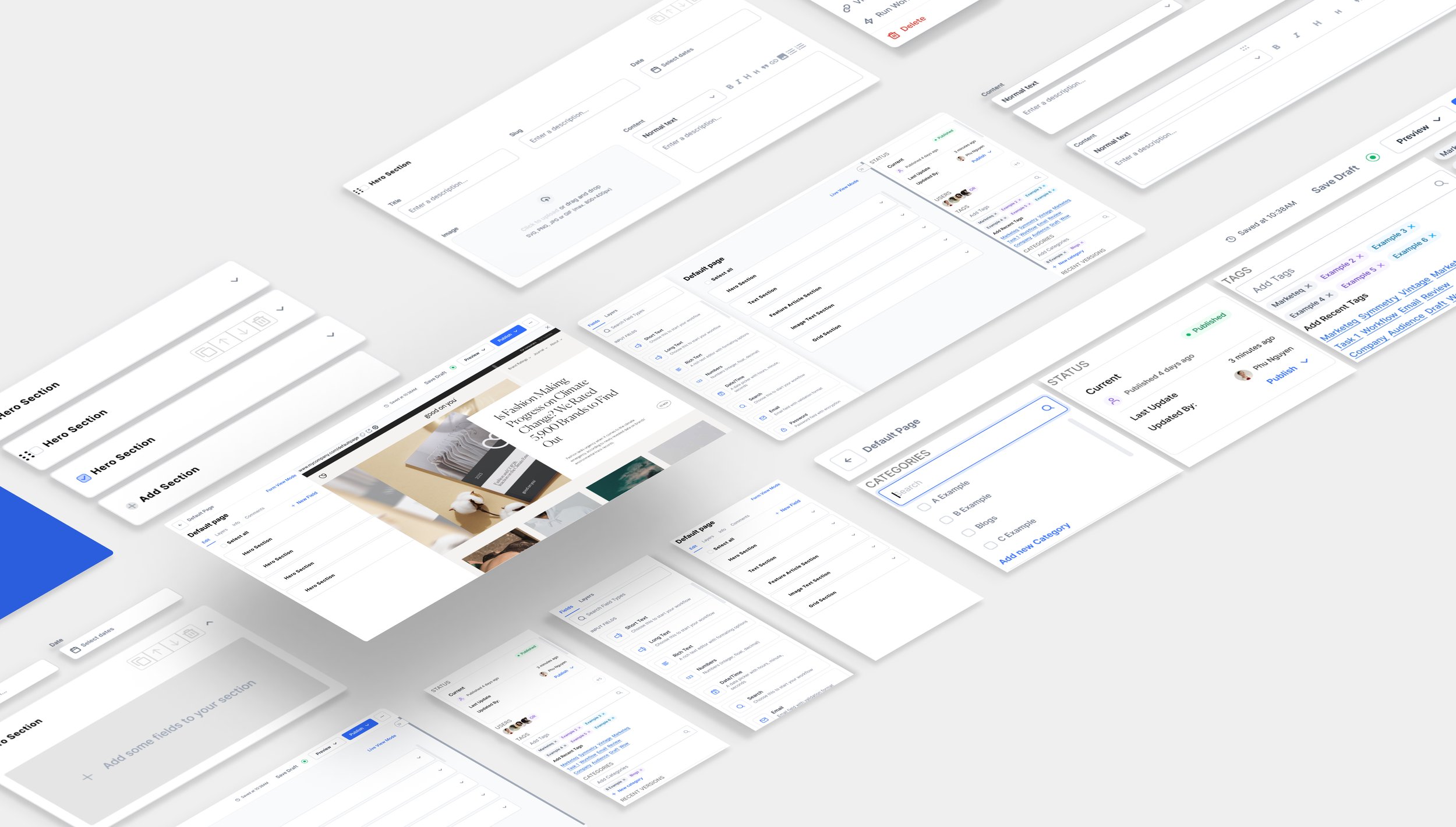
Our goal wasn't just a user-friendly headless CMS; we aimed to integrate compelling features for full customization. This involved creating an experience that felt liberating yet within defined parameters. Through a deep dive into Interaction Design, we introduced a drag-and-drop feature, refined micro-features in the informative side-bar, and implemented both live view and form view modes. The objective was to provide a genuinely friendly user experience that strikes a balance between freedom and structure.

Defining the Process
Collaborating with the CEO, we methodically split the process into four pivotal phases, recognizing the significance of each step. Given the expansiveness of the sprint, this strategic breakdown allowed me to narrow and compartmentalize each phase, channeling focused attention onto one task at a time.
Discovery
In the discovery phase, I compiled a comprehensive list of digital products to gain insights into what constitutes a robust headless CMS. The categorization involved three key groups:
Competition: Headless CMS’s
Best-in-Class: Website builders
Out-of-Category: Non-related but with inspirational aspects
Market Research
Analysis
After identifying and classifying 10 examples in each category, I initiated a card sort and developed user flows. This process significantly enhanced my understanding of the functionalities and scope each digital product presented.
Card Sorting
User Flows
In-depth annotations
I went ahead and annotated each screen in-depth. Doing so allowed me to dissect the entire digital product filtering out what works and what doesn’t work.
Feature Lists
Leveraging my compiled research, I categorized features into three distinct groups: Must-haves, Nice-to-haves, and Will-not-haves. This framework played a pivotal role in shaping my design decisions, as directed by my Senior Designer.
Must-have: Essential features for basic functionality.
Nice-to-have: Enhancements that contribute to an improved user experience.
Will-not-have: Features deemed confusing, harmful, or detrimental to the user experience.
Synthesis
From the three screenshot categories, I conducted a heuristic evaluation to understand how each platform organizes content, emphasizing usability. I also identified superior functions in other platforms. Recognizing patterns in headless CMS functionality, I drew inspiration from out-of-category and best-in-class examples, integrating features to enhance the overall user experience.
With the research and guiding force of my mentor, I established to create 4 main features to produce a functioning admin panel while taking a look into each feature’s microfeatures to create a cohesive product.
Live View Mode
Adaptability
Digital Workspace
Realtime editing
Content Management
Adding Fields
Resizing Fields
Column Management
Drag-n-drop Feature
Interactive Features
Bulk Actions
Sidebar Panel
Status
Users
Tags
Categories
Versions
Topbar Navigation
Preview
Publish
More Options
Last Saved
Status
Concepts and iterations
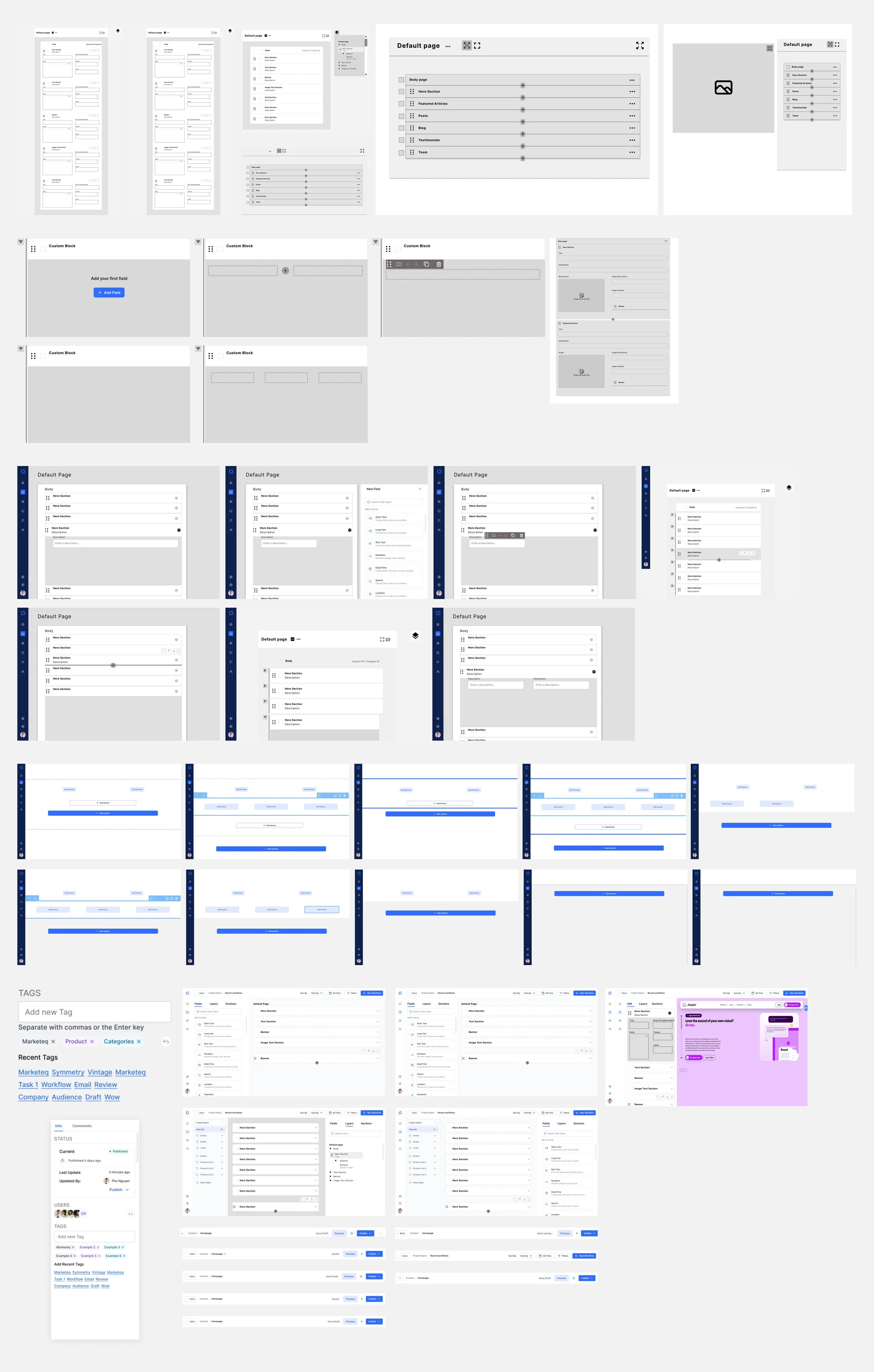
I wireframed iteratively and being able to bounce back with my senior designer, I was able to hone down on features that will best suit the product. I would wireframe each feature separately and focus on each microfeature within. Once finalized I would add this to the end screen.


Outcome
After completing all the prior phases and creating the research and wireframes, I began moving toward Final High Fidelity designs. Being able to establish a strong foundation transitioning into this phase happened seamlessly and the outcome was the final product of the Admin Panel. Of course, during this process, I would meet up with my senior designer to ensure industry-standard designs.
Content Management
Once I established a functional version of content managing I began to create the features that was established prior. We wanted to create a product that eliminated the necessity of a editing version where users can go in at anytime to either edit the content or add data sets to the model.
My approach was to take each Headless CMS platform and take it through a heuristic evaluation gaining the best aspects of each. While doing so I used other inspiration from other platforms to enhance the system.
Content Management: Components
These pieces are critical components of content management. After doing extensive research listing microfeatures that would help create a better experience, I began to create these components that would provide flexibility.
Active states
Moving between rows and columns
Quick/Bulk Actions
Drag and Drop
Hover States
Sidebar
I had to make separate components of the admin panel as tools to make the entirety of the panel interactive. By focusing on each platform and grabbing what was functional and experience-enhancing, I was able to produce these sidebars. This sidebar enables the user to interact with the document.
Sidebar: Components
After making a feature list, I was able to cement the most important features. I went ahead and created userflows and dissected each feature to create an interactive experience. Looking through, I was able to distinguish what makes an optimal sidebar.
Badges
Autofill
Publish Status
Invite Users
Create Tags
Add Categories
View Versions
Live-View Mode
Gaining inspiration from other CMS’s and collaboration with my senior designer, I created a live-view mode. With this, the users are able to see the results of their work in real-time. This would give the users the ease of managing their content with a reference.
Live-View Mode: Components
To remove any form of repetitiveness and optimize the use of space, I consolidated the 2 sidebars while in live-view mode. This would reduce clutter and provide a workable digital environment.
Users are able to edit content within the sidebar and bounce back between other tabs within.
Single Column View
Columns will be condensed into single columns while in live-view mode
Popup field bar
Due to the lack of digital work space, clicking on add field will prompt a popup window so users can use it accordingly
Top navigation bar
After researching other platforms’ navigation bars, I compiled a list of features that would work well with our current product. I categorized each feature into the usual must-haves, nice-to-haves, and will-not-haves. Upon multiple ideations, I was able to solidify my design decision with the help of my senior designer.

Takeaway: 1
Forms of research must back up all decisions. If you are designing solely based on assumption only, you have no basis of foundation. Don’t try to reinvent the wheel. When setting the design base, set a solid foundation that is user-friendly then it is deemed appropriate to add bells and whistles.
Takeaway: 2
Don’t dismiss other platforms just because they don’t fall within the same category. Being able to understand how the product differs from a headless CMS and a regular CMS gives space for innovation. I was able to gain inspiration from out-of-category platforms which gave our product a better user-experience.
Takeaway: 3
It’s easy to feel overwhelmed especially when your sprint is extensive but i learned that organzing your goals and features one step at a time helps narrow down the focus letting me notice the fine details of each work that goes into each component. Once establishing the each step I was able to knock out each step one by one.
Future opportunities
If my internship hadn’t ended, I would have dove deeper into the nice-to-have feature list to fully create a better interactive experience. The foundation of the design was created and is structurally sound but as a designer I was always looking for opportunities to enhance the product. Another realm I would like to explore would be seeing the user react with the admin panel and look at the impact the new designs had.
Conclusion
This project has given Marketeq a strong starting point for building an awesome content management system for projects. Combining thorough research, best practices, and industry-standard features allowed me to develop a content management page that truly stands out and exceeds industry norms. It's a cutting-edge solution that boosts Marketeqs competitiveness and offers users a seamless experience for new users moving from other headless CMS platforms.


