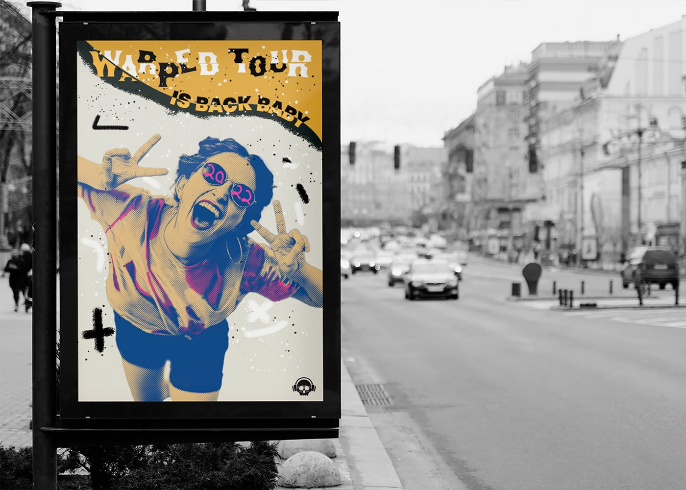
This is a student project that has no connection with Vans Warped Tour
Vans Warped Tour Visual Rebrand
The prompt was to rebrand a music festival and I had chosen Vans Warped Tour. After some research, Vans Warped Tour was discontinued following its 25-year run. The owner, Kevin Lyman, stated, “The festival was no longer feeding my soul and my heart as much”. My approach to rebranding this festival was to preserve the essence of what Vans Warped Tour stood for and to fill the gap between generations pleasing all groups.
Role
Branding & Identity
Completed
2022
Mentors
Rupert Reyneke
Sean Keating
Characteristics
Unconventional
Edgy
Energetic
Aggressive
Modern
Rule-Breaking
Imagery and Stylistic Elements
Typography
Becker Gothics
Inspired by tattoo typography, it represents the alternative nature of the festival. This application should be applied to headlines only and the logo itself.
Neue Haas Unica
This modern sans serif font was chosen due to it’s heavier weight to illustrate its bold presence. These characters can be employed to express powerful and expressive typography and used for body font
Logo Process and Ideations
Iterations of logo
I started off with some sketches and finalized it down to a skull wearing headphones to fit the theme of the brand. When I took it through the digital process the logo began to evolve and become more polished. The prior iterations helped me finalize the logo.
Brand Style Guide
Instagram Posts


